CSS (Cascading Style Sheets) is a language used to style HTML elements.
It controls:
- Colors (text, background, borders)
- Fonts (size, style, family)
- Spacing (padding, margin)
- Layout (position, alignment, grids)
- Effects (hover, animation, shadows)
💡 Example: HTML gives structure, CSS gives look & feel.
Analogy:
- HTML → skeleton of a website
- CSS → clothes, colors, hairstyle
2️⃣ How Many Ways Can We Write CSS?
There are 3 main ways to apply CSS to a webpage:
1. Inline CSS
- CSS is written inside an HTML tag using the
styleattribute. - Applied to a single element only.
Example:
<p style="color: blue; font-size: 20px;">Hello, World!</p>
✅ Pros: Quick for small changes
❌ Cons: Not reusable, messy for big websites
2. Internal CSS (Embedded)
- CSS is written inside a
<style>tag in the<head>section of HTML. - Can style multiple elements on that page.
Example:
<!DOCTYPE html>
<html>
<head>
    <style>
        p {
            color: green;
            font-size: 18px;
        }
        h1 {
            color: orange;
        }
    </style>
</head>
<body>
    <h1>Welcome</h1>
    <p>This is a paragraph styled with internal CSS.</p>
</body>
</html>
✅ Pros: Works for a single page
❌ Cons: Not reusable across multiple pages
3. External CSS
- CSS is written in a separate
.cssfile and linked to HTML using<link>tag. - Best for large websites with multiple pages.
Example:
style.css
body {
    background-color: #f2f2f2;
}
h1 {
    color: purple;
}
p {
    color: teal;
}
index.html
<!DOCTYPE html>
<html>
<head>
    <link rel="stylesheet" href="style.css">
</head>
<body>
    <h1>Welcome</h1>
    <p>This is a paragraph styled with external CSS.</p>
</body>
</html>
✅ Pros: Reusable, clean, maintainable
✅ Cons: Needs separate file
<!DOCTYPE html>
<html>
<head>
<title>Multi-Part Sections with Flex</title>
<style>
body {
font-family: Arial, sans-serif;
margin: 0;
padding: 20px;
background-color: #f9f9f9;
}
h1 {
text-align: center;
color: #333;
}
/* Container for flex sections */
.flex-container {
display: flex; /* Flexbox applied */
justify-content: space-around; /* Space evenly */
gap: 20px; /* Space between items */
flex-wrap: wrap; /* Wrap on small screens */
margin: 20px 0;
}
/* Individual card / part */
.card {
background-color: #fff;
border-radius: 10px;
padding: 20px;
width: 300px; /* Fixed width for uniformity */
box-shadow: 0 4px 8px rgba(0,0,0,0.1);
text-align: center;
}
.card img {
width: 100%;
height: auto;
border-radius: 10px;
}
.card h2 {
margin-top: 15px;
color: #333;
}
.card p {
margin-top: 10px;
color: #555;
line-height: 1.5;
}
/* Responsive */
@media(max-width: 1000px) {
.flex-container {
justify-content: center;
}
}
</style>
</head>
<body>
<!-- 2-Part Section -->
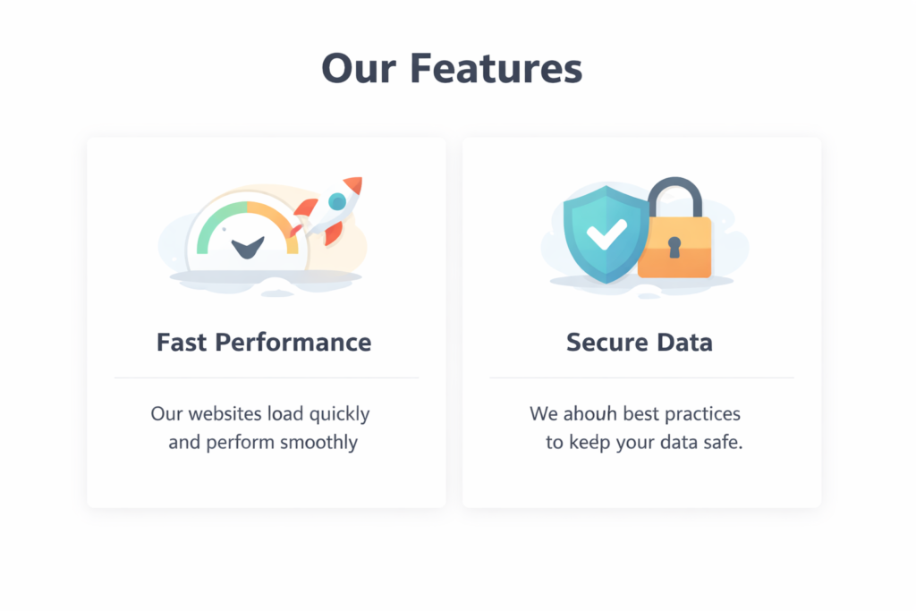
<h1>Our Features (2 Parts)</h1>
<div class="flex-container">
<div class="card">
<img src="https://via.placeholder.com/300" alt="Fast Performance">
<h2>Fast Performance</h2>
<p>Our websites load quickly and perform smoothly for all users.</p>
</div>
<div class="card">
<img src="https://via.placeholder.com/300" alt="Secure Data">
<h2>Secure Data</h2>
<p>We follow best practices to ensure your data is always safe and secure.</p>
</div>
</div>
<!-- 3-Part Section -->
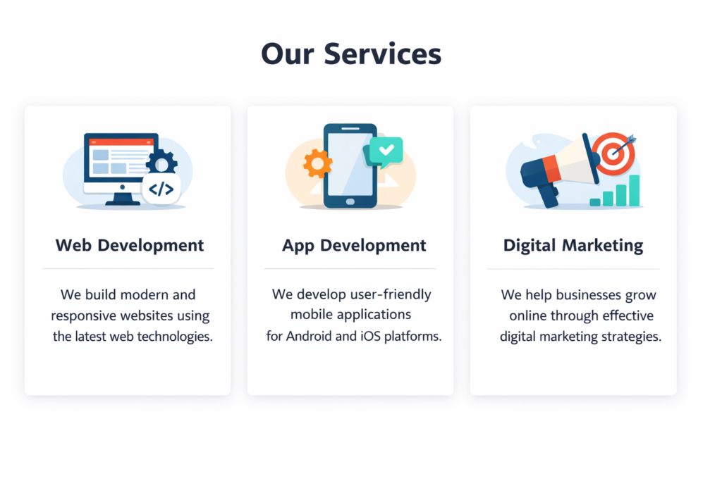
<h1>Our Services (3 Parts)</h1>
<div class="flex-container">
<div class="card">
<img src="https://via.placeholder.com/300" alt="Web Development">
<h2>Web Development</h2>
<p>We build modern, responsive websites using latest technologies.</p>
</div>
<div class="card">
<img src="https://via.placeholder.com/300" alt="App Development">
<h2>App Development</h2>
<p>We create mobile applications for Android and iOS platforms.</p>
</div>
<div class="card">
<img src="https://via.placeholder.com/300" alt="Digital Marketing">
<h2>Digital Marketing</h2>
<p>We help businesses grow online using effective digital marketing strategies.</p>
</div>
</div>
</body>
</html>